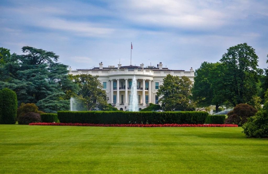
While you were distracted by a lot of other stuff, the new White House residents renovated whitehouse.gov, the official site of the US President. They did a rather nice job of it.
Let’s look at 5 smart (dare I say, science-backed) benefits of the freshly made-over site.
It’s undergone some welcome decluttering and under-the-hood work. There are thoughtful considerations for sensitive or weaker eyes (contrast and font size adjusters). There’s an attempt at a language other than English.
A few key takeaways are clear, but it comes up short on the content in two key areas, which I’ll get to below.
Contents
What’s good in the new whitehouse.gov
1. They kept WordPress
It didn’t take an executive order to change from Drupal to WordPress in 2017. Good choice on the part of the previous residents, and it seems they’ve done a good job with security.
I take pleasure in knowing the government of the richest and most powerful (in some ways) country in the world uses the same free CMS that I do.
It’s cool to be able to View Page Source and understand what’s going on. That’s relatable. And they’re not using Divi. Hand over heart, I am thankful.
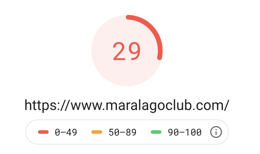
2. This site is fast
Google Page Speed Insights clocked it at

for desktop and
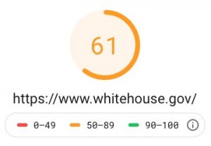
for mobile. It seems they’ve deferred js among other smart speed-ups. In fact, if you know what SEO stands for, you’ve probably run into the main issue – big image files.
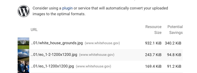
They need to optimize the White House image. That’s almost 1 MB getting rammed through your iPhone.
Apart from that, though, there are no glaring over-sizes.
Over at GTmetrix:
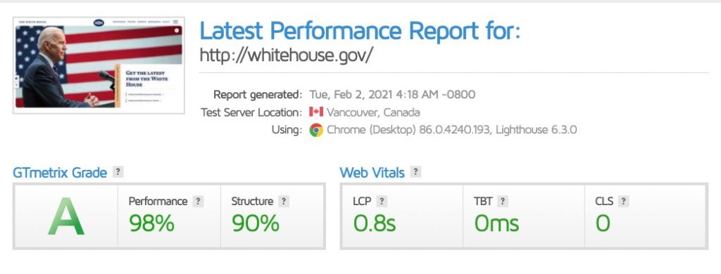
Teacher’s pet. At about a second fully loaded, and just 491ms to the first contentful paint. Nicely done. Beats my site.
Taking the two into account, whitehouse.gov is plenty fast. It just needs a bit of work on the mobile score, says Google.
Meanwhile in Florida…
3. Newspaper feel
I’m not a pro designer. Well, I’m not a designer in that I just do a bit of design. But I can appreciate a balance of serif and sans serif as much as the next guy at the Denny’s counter.
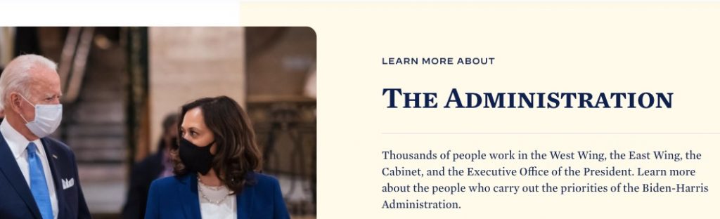
This combo, set against a soft yellow gives it a vague Financial Times sort of vibe. I usually favor serif in the titles and sans-serif in the main, but the flip works OK.
The fonts are from New York-based type foundry Hoefler&Co, put together especially for Biden‘s campaign. Apparently, they used the reverse, serif over sans-serif, during the campaign. Now they’ve flipped it.
The serif Mercury has a commanding feel. It has a nice roundness and the ligatures aren’t a nuisance. The sans-serif Decimal is bland, but only makes a few appearances and its vertical flatness works OK as a sort of ticker tape.
With the main text set in dark blue, rather than black, it doesn’t burn the eyes.
The site’s a smooth and easy read. On that note…
4. Whitespace aplenty
It’s the White House, the whitespace White House. That helps with dealing with some of the very long passages of text on the verbose pages, and shows best on the more readable pages, like VP Harris’ bio.

5. Humble, impartial content
As we may expect, the previous administration’s design and copy choices were gaudy and congratulatory. That’s how they rolled and many loved them for it.
The Biden–Harris page just states the facts. It’s rather boring, inhttps://www.whitehouse.gov/administration/vice-president-harris/ fahttps://www.whitehouse.gov/administration/vice-president-harris/ct.
- Paris Climate Agreement
- A Proclamation on Adjusting Imports of Aluminum Into the United States
- Press Briefing by…
- Statement by…
They’re not headlines as much as they are road signs. And in these times, that dullness is alright. Still dull, though.
In the site’s bureaucratic tone and vocabulary, it creates a feeling of distance. See below.
Revision requests for whitehouse.gov
They’ve only been on the task for a short time, so I’ll go easy on them, but these are two areas they should easily have the budget and labor for.
1. Watch your readability
For the average reader, all this stodgy factual text also smacks of the Ivy League hordes taking up residence in the White House.
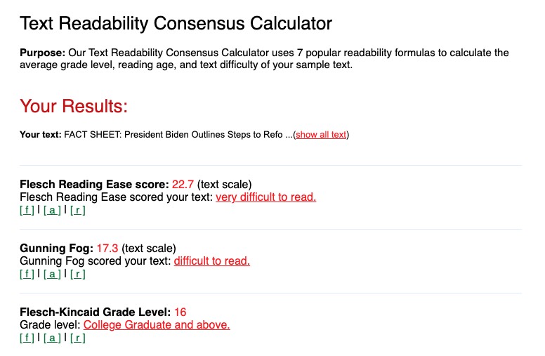
I plugged the uncomfortably titled, “FACT SHEET: President Biden Outlines Steps to Reform Our Immigration System by Keeping Families Together, Addressing the Root Causes of Irregular Migration, and Streamlining the Legal Immigration System” into Readability Formulas.
And let’s say, Flesch–Kincaid would feel vindicated in formulating their instrument.
Or rather, they’d feel their tool was created for a good reason.
Plain writing is not dumbing things down. It writing so people can read it and understand it. Easily. Without needing a dictionary.
Somewhere around Grade 6–7 (the equivalent of the school grade) is the sweet spot.
The FACT SHEET got:
With monsters like this:
“First, the Administration will address the underlying causes of migration through a strategy to confront the instability, violence, and economic insecurity that currently drives migrants from their homes. Second, the Administration will collaborate with regional partners, including foreign governments, international organizations, and nonprofits to shore up other countries’ capacity to provide protection and opportunities to asylum seekers and migrants closer to home.” (That’s 62 words in just two sentences.)
that’s a well-earned Grade 16.
White House Briefing Room, if your goal was to be snooty and inaccessible, you nailed it. That’s what your Ivy League education buys you.
Copywriting? Much cheaper and, in many ways, more valuable.
Can we get Bernie in here to clean this up? (no meme, you’re welcome)

Bernie has that special talent for talking like a normal person. It’s a big reason people like him on, ack, Both Sides of the Aisle.
He might say:
“Well, folks, we’ll be looking at why people leave their homes. There must be reasons! Instability. Violence. Economic insecurity. You name it!”
Of course, you can’t write just like you speak. But you can get close. And you can break a few grammatical rules.
Another way to write that FACT SHEET monster passage may be,
First, the Administration will look at why people are migrating from their homes. It will look for reasons behind this migration; such as instability, violence, or lack of a regular income. And it will create a strategy to deal with these issues.
Then, it will work with regional partners. These include foreign governments, international organizations, and NGOs.
Through this approach, countries closer to the homes of asylum-seekers and migrants will be better able to protect them and provide them with opportunities.
A bit better, isn’t it?
2. Multi-language capabilities
While many governmental sites around the world have multiple languages in addition to the requisite home language and English, whitehouse.gov only has Spanish.

OK, but it’s not a full site-wide translation in Spanish; it’s only a selection of articles.
So, yes, the Español inclusion is muy bien, and every bit of content should be in Spanish, considering the US has 41 million people who speak Spanish at home.
Yet that turns an inhospitably cold shoulder to the other Indo-European languages, like Russian and Persian. There’s a ton of Russians and Iranians in the US, being productive citizens.
Then, where are the many Asian languages, like Chinese and Vietnamese? Go to Chinatowns across the US and you’ll find older Chinese who only speak a few words of English. They’re still US citizens. How will they learn about what Joe and Kamala are up to?
And while we’re at it, how about a Simplified English site?
Conclusion: Build back whitehouse.gov even better
The new White House site is a clean break from the heftily colored and essentially unbranded Trump page. It’s also got a much-needed impartial tone.
It manages to be useful and accessible while still showing some faces and have a slight magazine feel.
The design’s strength, however, can’t hide the content’s shortcomings. Readability is poor in parts. There’s only one language other than English and it’s only a partial translation of the site content. The whole thing lacks approachability, needs more Bernie mittens.
So now, how about making the site ultra-accessible to the diverse population and to people of all ages? Use the site not just for PR but for connecting.